Rebranding of Title Tool with focus on Usabilty
Who?
TitleTool is a product that aims to simplify the process of translating videos by creating translation jobs for different translators and allowing them to easily translate corresponding videos by subtitles.
What did I do?
My job was to restructure and redesign the whole product. Therefore, I was doing a competitors analysis, analyzing the current UX problems by doing a user testing with the actual state. I came up with a new structure by building a sitemap and a user flow and creating a Mid-Fi click dummy which I again tested with real users to finally come up with a Hi-Fi Prototype.
Status Quo of TitleTool
The current tool - as I figured out via usability tests - had some huge user experience problems.
A: As the tool is being used on an iPad the smallest the hamburger menu is quite hidden even it is the main menu the user needs to go through
B: In general important buttons have no description and are by far not self-explanatory
C: the hierarchy of actions that can be taken is not clear and users didn't know what to do first
D: it's not clear why the Asset section is also seen as the home of the tool
E: unclear how to create a new translation
F: the translation page was not understood at all
Current Status
Goal: Create a cleaner, more modern interface design with a new hierarchy of actions so the user is not overwhelmed
Problem Definition: The Titletool offers a lot of functionalities which need to be more explanatory and tidied up so the user can understand their sense.
Idea: clear information architecture
USP: Make it easy to create translation jobs for lots of different videos
New Sitemap and User Flows
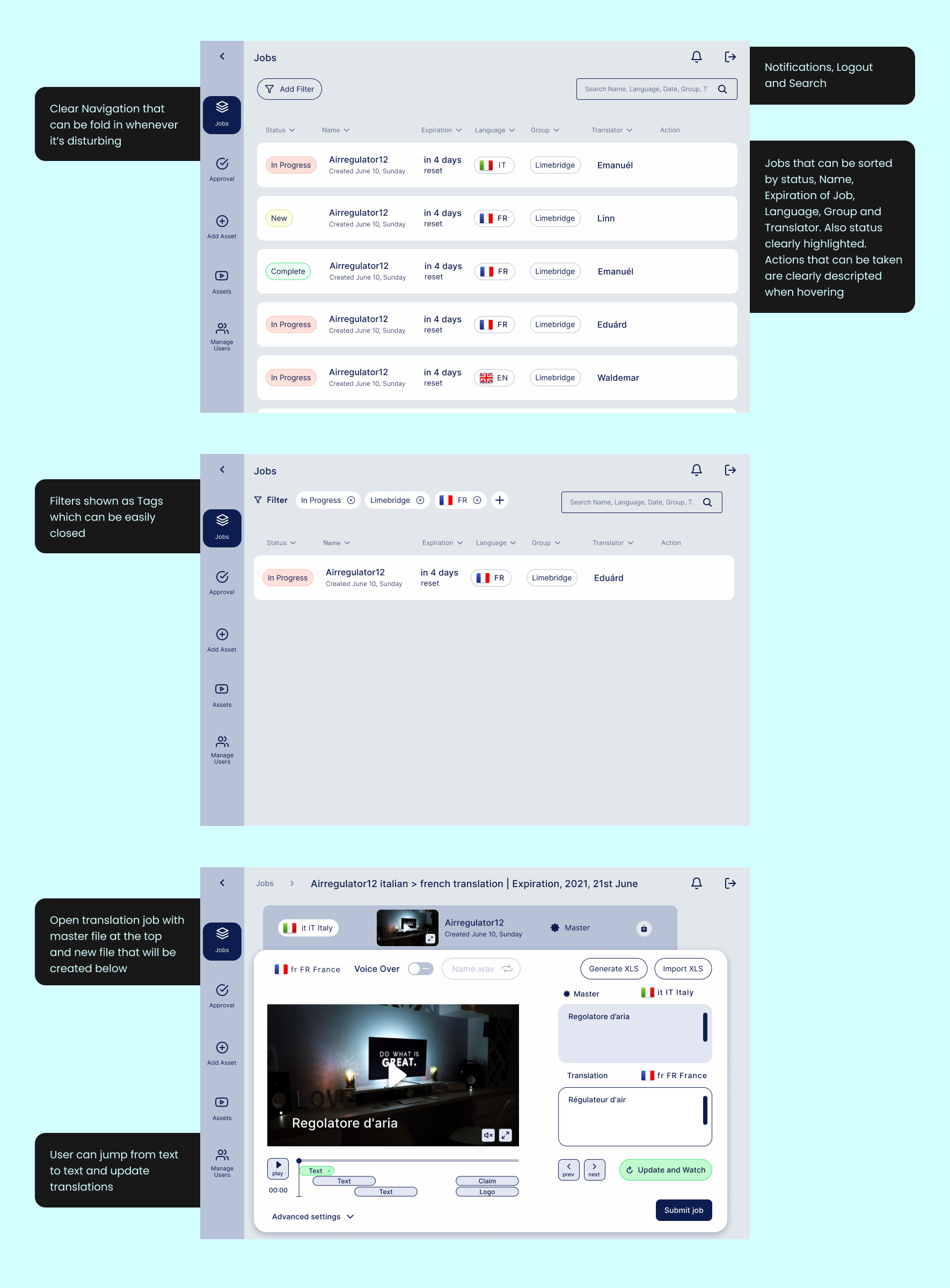
Final Wireframes for 'Job' Section
Final Wireframes for 'Asset' Section

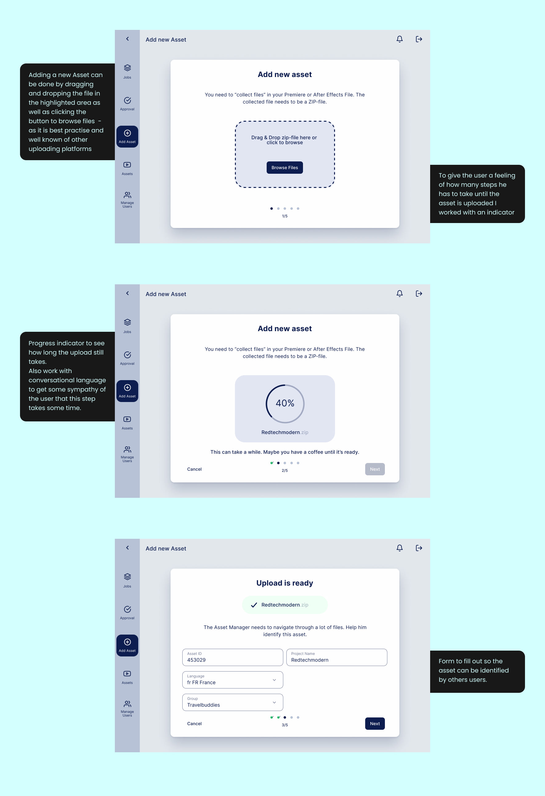
Final Wireframes for 'Add new Asset'
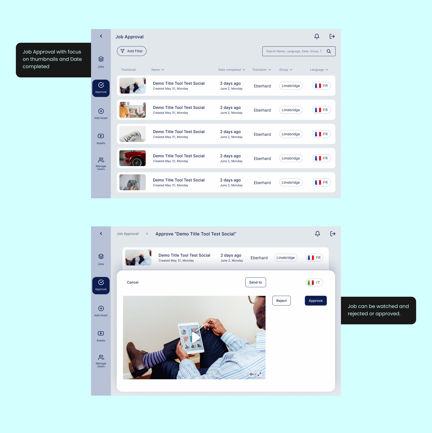
Final Wireframes for 'Job Approval'
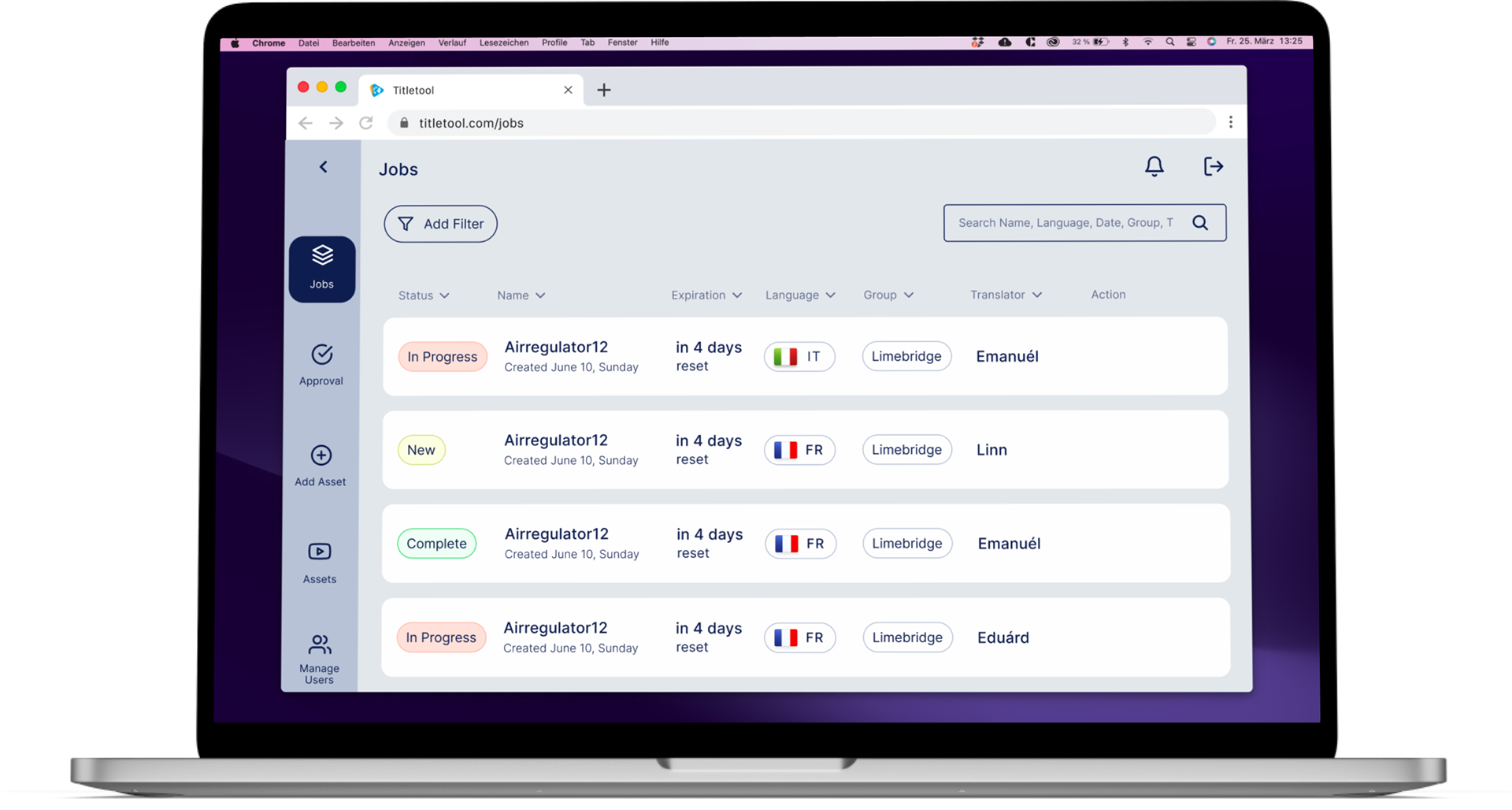
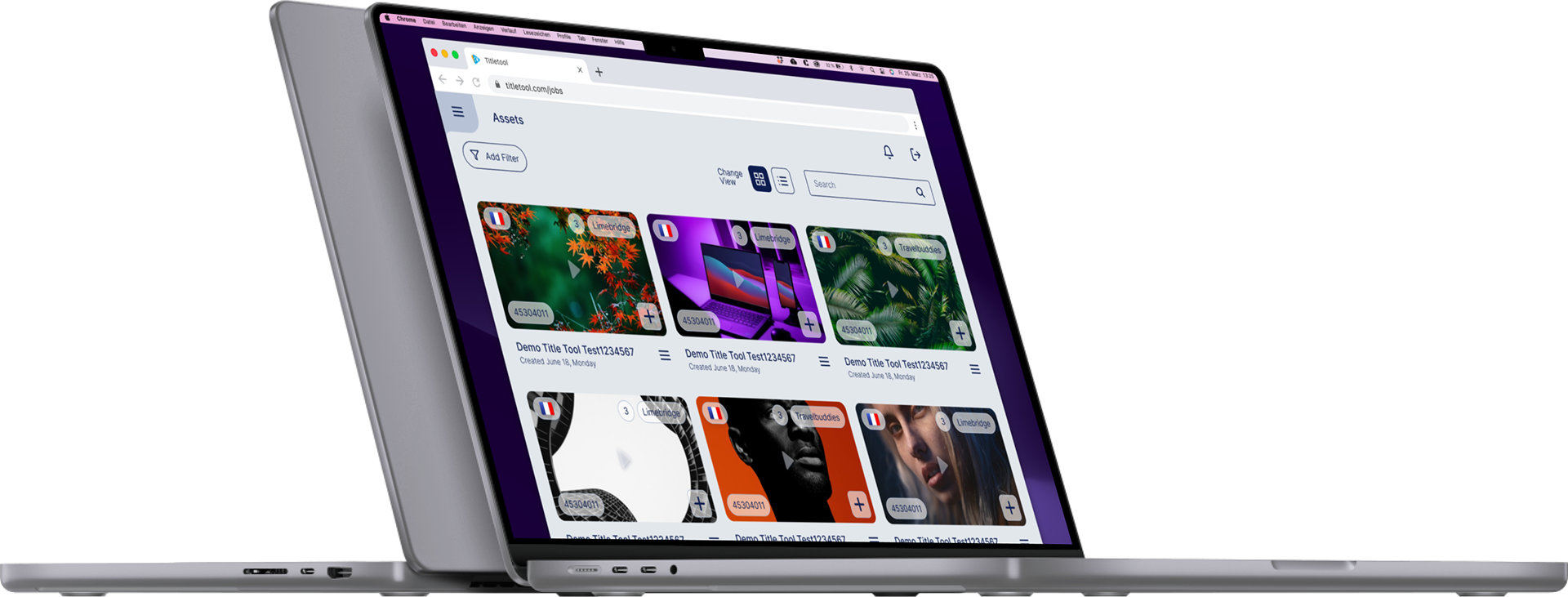
Usage Mockup in a Browser
Clickable Prototype Video
🧡 Let's work together 🧡
🧡 Thank you for getting in touch 🧡! I will reply within 2 working days ✌️